
Dashboard
The WiFi Hotspot Dashboard provides a complete overview of guest activity, network usage, marketing performance, and revenue across all managed locations.
Administrators can review key performance indicators, identify usage trends, compare locations, track returning guests, and monitor campaign results from a single screen. Dashboard statistics automatically reflect the selected reporting period and WiFi location.
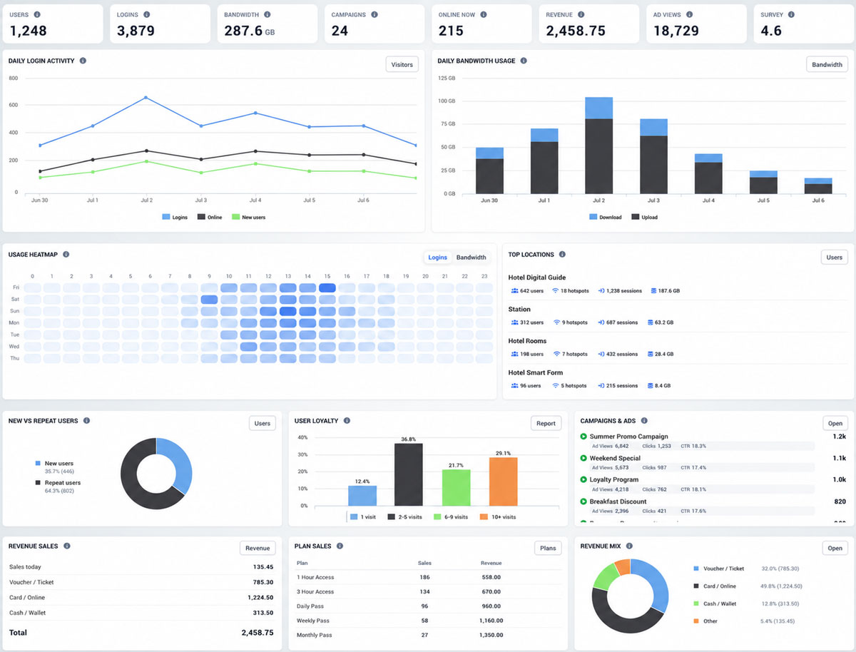
Dashboard Overview
The summary panels at the top of the Dashboard display the most important account statistics:
Users – Total number of registered guest profiles.
Logins – Total number of successful guest login sessions.
Bandwidth – Combined upload and download traffic generated by connected users.
Campaigns – Number of configured advertising and engagement campaigns.
Online Now – Number of users currently connected to the WiFi network.
Revenue – Total revenue generated through internet plans, vouchers, online payments, and other supported payment methods.
Ad Views – Total number of advertising impressions generated through splash pages and campaigns.
Survey – Average survey rating collected from guest responses.
Daily Login Activity
The Daily Login Activity chart shows how guest activity changes over the selected reporting period.
The chart compares:
Logins – Successful WiFi login sessions
Online – Active user connections
New users – Guests connecting for the first time
This information helps administrators identify peak usage periods, changes in visitor volume, and the relationship between new and returning guests.
Daily Bandwidth Usage
The Daily Bandwidth Usage chart displays the amount of network traffic generated each day.
Upload and download traffic are shown separately, making it easier to detect high-consumption periods and understand how guests are using the available internet connection.
Usage Heatmap
The Usage Heatmap displays login or bandwidth activity by day of the week and hour of the day.
Darker cells represent periods with higher activity. Use the Logins and Bandwidth options to switch between connection activity and data consumption.
The heatmap helps identify:
- The busiest hours of the day
- The most active days of the week
- Periods with low network utilization
- Recurring guest usage patterns
Top Locations
The Top Locations panel compares activity across managed WiFi locations.
For each location, the Dashboard displays:
- Number of users
- Number of hotspots
- Number of sessions
- Total bandwidth usage
This comparison is useful for multi-location businesses that need to identify their most active venues and evaluate performance by site.
New vs Repeat Users
The New vs Repeat Users chart compares first-time guests with users who have previously connected to the network.
A higher percentage of repeat users can indicate stronger guest retention, frequent visits, or successful WiFi marketing and loyalty campaigns.
User Loyalty
The User Loyalty chart groups guests according to the number of recorded visits:
1 visit
2–5 visits
6–9 visits
10 or more visits
These statistics help identify returning customers and audience segments that may be suitable for targeted promotions, loyalty offers, or automated Engage campaigns.
Campaigns & Ads
The Campaigns & Ads panel provides a quick overview of active marketing campaigns and their performance.
Depending on the campaign type, administrators can review information such as:
- Ad views
- Clicks
- Click-through rate
- Campaign activity
Select Open to access detailed campaign configuration and reporting.
Revenue Sales
The Revenue Sales panel summarizes income generated through the WiFi Hotspot service.
Revenue is grouped by payment source:
- Voucher or Ticket
- Card or Online payment
- Cash or Wallet
- Total revenue
Select Revenue to open the complete revenue report.
Plan Sales
The Plan Sales panel shows the performance of paid internet plans.
For each plan, administrators can review:
- Plan name
- Number of sales
- Revenue generated
This information helps identify the most frequently purchased plans and compare their financial performance.
Revenue Mix
The Revenue Mix chart displays the percentage of total revenue generated by each payment method.
This provides a clear overview of how guests purchase internet access and which payment channels generate the highest revenue.